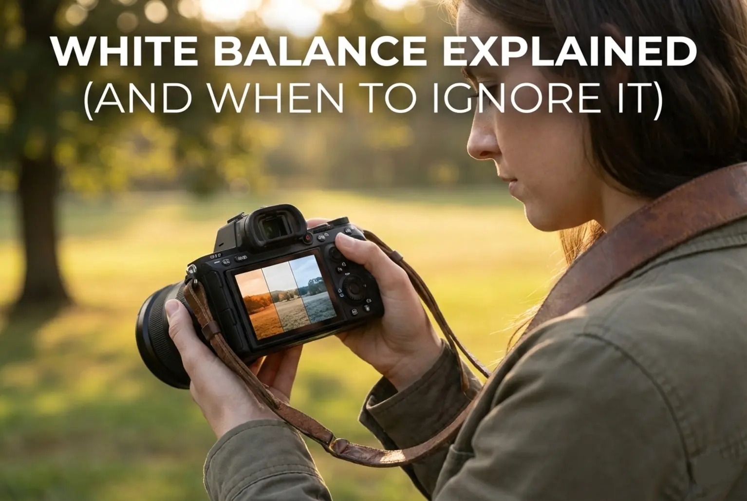
Hey there, fellow light-chasers! Let’s talk about that one “oops” moment we’ve all had. You’re out shooting a gorgeous indoor wedding or maybe a cozy dinner, you get home, open your files, and everyone looks like they’ve had a very bad run-in with a bottle of fake tan. Or worse, they look like Smurfs because the room was filled with “cool” daylight. That, my friends, is the White Balance (WB) monster at work. For the longest time, I just left my camera on Auto and hoped for the best, but let’s be honest: your camera is smart, but it doesn’t have artistic taste. It sees a white wall under orange lights and tries to turn it grey, often sucking the soul right out of your shot.
In this guide, I’m going to pull back the curtain on color temperature. We’re going to look at the Kelvin scale (don’t worry, it’s not as “science-y” as it sounds), how to use those little icons in your menu, and—most importantly—when you should tell the “correct” settings to take a hike so you can create a mood that actually feels real. If I were shooting this morning’s misty sunrise, I wouldn’t want it “neutral.” I’d want it to feel as cold and crisp as it actually was. That’s the power of mastering your white balance. We are going deep into the physics, the gear, and the creative psychology of color to ensure you never have a “color disaster” again.
1. The Science of Color Temperature: Why Light Has “Heat”
To understand White Balance, we first have to talk about Color Temperature. In physics, this is based on the “black body radiator” theory—essentially, as you heat an object, it glows different colors. At lower temperatures, it glows deep red and orange. As it gets hotter, it turns white, then eventually a piercing blue. This is why we measure light in Kelvin. It sounds counterintuitive, but “warm” orange light actually has a lower Kelvin temperature (around 2700K), while “cool” blue light has a much higher temperature (above 7000K).
Your camera sensor is a literalist. It records exactly what hits it. Our brains, however, are incredible at auto-correcting. If you look at a white piece of paper under a yellow lightbulb, your brain still knows it’s “white.” But without the right settings, your camera sees that yellow light and records a yellow paper. Understanding this physics is the foundation of our photography basics guide, where we break down how sensors interpret the world. When you manually adjust your WB, you are essentially telling the camera how to “neutralize” the dominant color of the light source to bring that paper back to white.
If I were shooting this in a studio environment, I’d be hyper-aware of the Color Rendering Index (CRI) of my bulbs. Not all 5600K lights are equal. Some have nasty green or magenta spikes that Kelvin alone can’t fix. This is where the “Tint” axis comes into play, which we will explore in the advanced technical section later on.
2. The Kelvin Scale Cheat Sheet: Common Light Sources
Before you dive into your menus, you need a mental map of where common light sources land. Most modern cameras allow you to dial in a specific Kelvin number, which is infinitely more precise than using icons. If you’re looking to get more control over your environment, checking out the latest full frame mirrorless cameras will give you much finer increments in Kelvin adjustments—often down to 10K steps.
Below is a breakdown of the temperatures you’ll encounter most often. If you memorize these, you’ll be able to set your camera before you even take the first test shot. It saves time and makes you look like a total pro on set.
| Light Source | Kelvin Range | Dominant Color Cast |
|---|---|---|
| Candlelight / Sunset | 1000K – 2000K | Deep Orange / Red |
| Tungsten (Household Bulbs) | 2500K – 3500K | Yellow / Orange |
| Fluorescent (Office Lights) | 4000K – 4500K | Cool White / Greenish |
| Midday Sunlight / Flash | 5000K – 5600K | Neutral White |
| Overcast Sky / Cloudy | 6000K – 7500K | Soft Blue / Grey |
| Deep Shade / Clear Blue Sky | 8000K – 10000K | Heavy Blue |
3. Manual Kelvin vs. In-Camera Presets: Which Is Better?
Most cameras offer presets: Sunlight, Shade, Cloudy, Tungsten, Fluorescent, and Flash. These are basically “short-cuts.” For example, the “Shade” preset usually dials in about 7500K. This tells the camera: “The light is very blue, so please add a lot of amber to warm it up.” While presets are better than Auto, they are still generic. Not all shade is the same. The shade under a green tree is different from the shade of a skyscraper in the city.
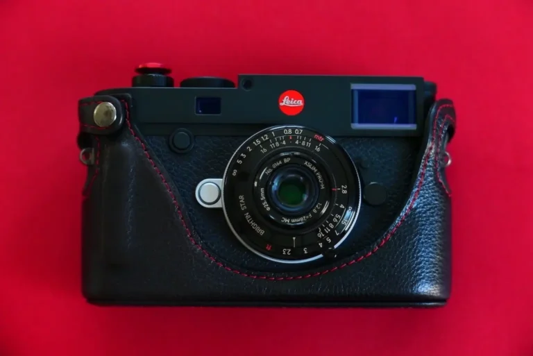
Manual Kelvin (K Mode) is my personal favorite. It gives you 100% control. By dialing in the number yourself, you can achieve perfect consistency across multiple shots. If you’re doing a professional portrait session, the last thing you want is the color temperature shifting slightly between frames because the Auto WB got confused by a subject’s colorful shirt. For those who want the ultimate precision, I always suggest using an external color meter to get a literal digital readout of the light hitting your subject.
Here’s what I’d actually do: I start with a preset that looks “close,” then I switch to K-mode and fine-tune it until the skin tones look healthy. Skin is the hardest thing to get right. If the skin looks “muddy,” you’re likely too cool. If it looks “sunburned,” you’re too warm. Mastering this is a core part of our tutorials category, where we dive deep into color theory.
4. Advanced Technique: The Custom White Balance Workflow
When “close enough” isn’t good enough, you need to use Custom White Balance. This is the gold standard for studio and commercial work. It involves telling the camera exactly what “neutral” looks like in your current lighting environment. To do this properly, you need a Grey Card. Using a neutral grey card ensures that your camera isn’t fooled by optical brighteners often found in white paper.
The Professional Workflow:
1. Place your grey card in the same light that is falling on your subject.
2. Set your camera to Manual Focus (to prevent it from hunting on the flat surface).
3. Fill the entire frame with the card and take a photo.
4. Go into your camera’s “Custom WB” menu and select that photo as the reference.
5. Switch your White Balance mode to “Custom.”
Boom. Your colors are now mathematically perfect for that specific light. This is especially vital for product photography. If you are shooting a specific brand of red lipstick, that red needs to be exactly the right shade of red. You can’t leave that to chance. For a deeper look at how the camera processes this data at the pixel level, check out our guide on how camera sensors work.
5. The “Tint” Axis: Dealing with Green and Magenta Casts
If you’ve ever shot under cheap office florescent lights and wondered why everyone looks like they’re about to be sick, it’s not the Kelvin scale’s fault. It’s the Tint axis. While Kelvin moves from Blue to Yellow, the Tint axis moves from Green to Magenta. This is the advanced technical layer that many beginners ignore.
Lights like LEDs and old-school tubes don’t always have a full spectrum of color. They often have a “spike” in the green channel. To fix this, you have to add Magenta. Most modern cameras have a “WB Shift” grid in the menu. This allows you to move a little dot toward Magenta or Green. If I’m shooting in a gym or a warehouse, I almost always have to push my Tint toward Magenta to neutralize the “poisonous” green glow of the overhead lights. If you’re struggling with this, grabbing a ColorChecker Passport can help you create custom profiles for these difficult environments during post-processing.
Most beginners make this mistake: They try to fix green light by changing the Kelvin to be warmer. This just results in “warm green” skin, which is even worse! You have to address the specific axis that is out of balance. This is why shooting in RAW is non-negotiable for professional color work.
6. Real-World Scenario: The Mixed Lighting Nightmare
Imagine you are shooting a portrait of a chef in a kitchen. There is a large window to the left letting in blue daylight (6000K). Overhead, there are warm tungsten spotlights (3000K). On the stove, there’s a blue flame from the gas burner. This is mixed lighting, and it is the ultimate test of a photographer’s skill.
In this scenario, you cannot have a single “correct” white balance for the whole frame. If you balance for the window, the kitchen looks like it’s on fire (too orange). If you balance for the tungsten, the chef’s face (lit by the window) looks like a ghost (too blue). What should you do?
Here’s what I’d actually do: I always prioritize the light hitting my subject’s face. If the window light is the “key” light, I set my WB to 5600K. The “warm” background lights then become an artistic choice—they add a cozy, professional depth to the scene. If the orange is too distracting, I might use a “gel” on the indoor lights to match the window, or I’ll use a powerful flash to overpower the tungsten. Consistency is key. You can also use a color correction gel kit for your flash to match the ambient light perfectly before the shutter even clicks.
7. RAW vs. JPEG: The Safety Net You Need
We need to talk about the “Bake-In” factor. When you shoot in JPEG, the camera processes the image and “bakes” your chosen White Balance into the pixels. If you got it wrong, trying to fix it in Lightroom is like trying to take the eggs out of a cake after it’s been baked. You can shift the colors a little bit, but eventually, the image will fall apart, producing “banding” and noise.
When you shoot in RAW, the White Balance is just a piece of metadata. It’s a suggestion, not a permanent change. The sensor records all the raw data, and you can change the Kelvin from 2000K to 10,000K in post-production with zero loss in quality. This is why I always say: shoot RAW if you care about color. It gives you a “time machine” to go back and fix mistakes made in the heat of the moment. However, don’t use this as an excuse to be lazy! Getting it right in-camera saves hours of editing time and keeps your workflow clean.
Let’s be honest: Even as a pro, I sometimes forget to change my WB when moving from outdoors to indoors. RAW has saved my skin more times than I can count. If you’re doing high-volume work like weddings, this safety net is essential. For the best editing experience, make sure you’re using a calibrated monitor so you can actually trust what you see during that RAW conversion.
8. Common Mistakes: A Micro-Analysis of Color Errors
Even seasoned photographers trip up on these specific “color traps.” Let’s break them down so you can avoid them.
- The “Green Leaf” Reflection: When shooting portraits in a lush forest, sunlight hits the green leaves and bounces green light onto your subject. The Fix: Don’t just change Kelvin; move your WB Shift toward Magenta.
- The “Blue Shadow” Syndrome: On a sunny day, shadows are lit by the blue sky, not the yellow sun. If you set your WB for the sun, your shadows will look unnaturally blue. The Fix: Use the “Shade” preset or bump your Kelvin up to 7000K to warm up those dark areas.
- The “Auto WB” Flicker: When shooting video, Auto WB will often “drift” as you move the camera, causing the colors to shift mid-take. It looks incredibly amateur. The Fix: Always lock your White Balance to a manual Kelvin setting for video.
- Over-Correcting Golden Hour: The whole point of golden hour is the warmth! If you use Auto WB, the camera will try to “neutralize” the beautiful orange sunset, making it look like a boring afternoon. The Fix: Set your WB to “Daylight” (5200K) to preserve that golden glow.
9. Daisy’s Mini Challenge: The “Three Temp” Exercise
Ready to put this into practice? I want you to try this simple challenge to see how Kelvin changes your world. Find a scene with neutral colors—like a white coffee mug on a wooden table near a window.
- Step 1: Set your camera to 3000K and take a shot. Notice how the daylight looks incredibly blue? This is because you told the camera the light was orange, so it added blue to “fix” it.
- Step 2: Set your camera to 5600K (Daylight). The mug should look white and natural. This is your “baseline.”
- Step 3: Set your camera to 8000K. Now the mug looks very warm/orange. You told the camera the light was blue, so it added amber.
By seeing these extremes, you’ll start to understand how the camera “thinks.” It’s always trying to do the opposite of the ambient light to reach neutral. Once you grasp this “opposite” logic, you’ll be able to manipulate color like a master. If you’re looking for gear to help you with these creative experiments, a variable ND filter is great for keeping your settings consistent while you play with color in bright light.
Final Thoughts on Mastering the Kelvin Scale
Mastering White Balance is about transitioning from a photographer who takes pictures to a photographer who makes images. It’s the difference between documenting a scene and interpreting it. By understanding the Kelvin scale and the Tint axis, you gain the ability to control the literal temperature of your viewer’s emotions. Whether you use a grey card for scientific precision or intentionally “break” the rules for a cinematic blue hour look, the control is now in your hands. Don’t be afraid of those manual settings; they are the key to your unique creative voice. Keep practicing, keep experimenting with your Kelvin shifts, and most importantly, keep chasing that perfect light! I can’t wait to see how you use color to tell your next story.
Frequently Asked Questions
Q: Does White Balance affect my exposure?
A: Technically, no. White Balance doesn’t change the amount of light hitting the sensor (Aperture, Shutter Speed, and ISO do that). However, it does change how the data in the Red, Green, and Blue channels is boosted. A very “warm” WB might cause your Red channel to “clip” (lose detail) more easily than a neutral setting.
Q: Should I use a “White Card” or a “Grey Card”?
A: Always use a 18% Neutral Grey Card if possible. Many white objects (like paper or t-shirts) have “optical brighteners” that reflect UV light as blue, which can trick your camera into making the final image too warm. Grey cards are designed to be spectrally neutral.
Q: Can I use Auto White Balance (AWB) for everything?
A: You can, but you shouldn’t. AWB is okay for casual snapshots, but it struggles with large blocks of single colors (like a field of grass) and can vary from shot to shot, making your editing process a nightmare. Manual Kelvin is always better for consistency.
Q: What is the best White Balance for night street photography?
A: This is purely creative! If you want the “classic” urban look, try 3200K to 4000K. This will make the street lights look fairly natural while turning the sky and shadows a deep, cinematic blue. If you want it to feel “gritty” and warm, try 5600K.